


Dashboard Examples for Sales, Finance, Marketing, and SaaS Teams
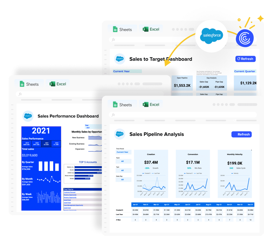
A good dashboard shows you which metrics belong on screen, how they should be arranged, and what the layout should communicate to the person reading it. The dashboard examples in this library go further than screenshots, heat maps, graphs and data visualizations: each one is a working template in Google Sheets or Microsoft Excel that you can open, populate with your own data, and use immediately.
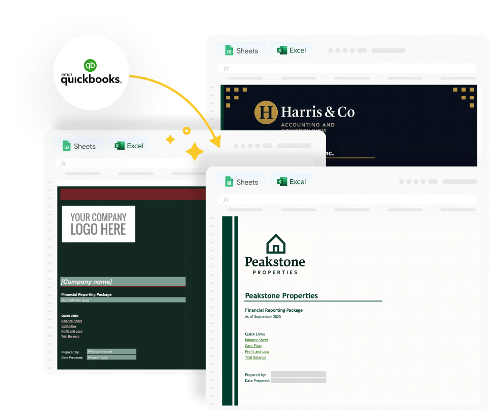
Every dashboard example here is available as a free download. Use it as a static dashboard with your own data today, or connect to a live data source for automatic refresh. Either way, the structure, charts, and KPI logic are pre-built and ready to run.
Types of dashboard examples
Dashboard examples fall into four categories based on audience and purpose. Understanding which type you need shapes every subsequent design decision.
Operational & Management dashboards
Operational dashboards show the current state of day-to-day performance. They are consumed daily or weekly by team leads and sales managers who need to act on what they see. Metrics are specific and time-sensitive: deals created this week, tickets resolved today, social media ad spend vs. budget this month. These dashboards prioritise speed of comprehension over depth of analysis. The reader needs to spot what needs attention in under ten seconds.
Analytical dashboards
Analytical dashboards are built for pattern recognition and trend analysis. They are consumed by analysts and managers who need to understand why performance is changing, not just whether it is. Metrics include period-over-period comparisons, cohort breakdowns, funnel conversion rates by stage, and variance analysis against targets. These dashboards tolerate more visual complexity because the audience has time to explore the data.
Strategic & Executive dashboards
Strategic dashboards give executives and boards a high-level view of company health against long-term objectives. They are typically consumed monthly or quarterly. Metrics are aggregated: total ARR, gross margin, CAC payback period, headcount vs. plan, and net revenue retention. The design optimizes for simplicity with one screen, the five numbers that matter most, with clear indicators of whether each is on or off track and help make data-driven decisions. Often presented to C-level executives & stakeholders like CMOs, CEOs and VCs.
Tactical dashboards
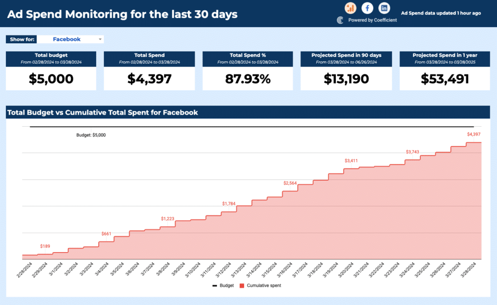
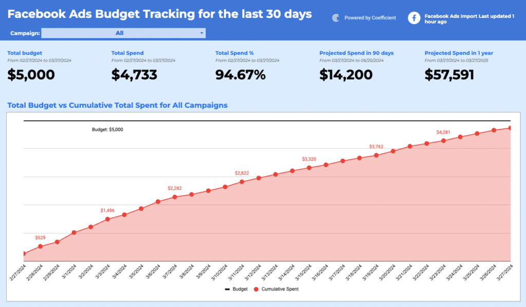
Tactical dashboards track performance against a specific campaign, project, or initiative with a defined time horizon. An ads dashboard tracking spend vs. ROI over a 90-day period for customer acquisition, or a project tracker monitoring milestone completion against a launch date, are both tactical. These dashboards are often temporarily built for a specific purpose and retired when the initiative ends.
What should a dashboard example include?
The most common mistake in dashboard design is including too much. A dashboard with fifteen KPIs communicates that everything is equally important which means nothing is prioritised. The dashboard examples in this library follow four design principles that keep dashboards useful rather than decorative.
Five to eight KPIs maximum. Every metric on the reporting dashboard should connect to a decision. Before adding a KPI, ask: if this number changes, what action would someone take? If the answer is unclear, the metric should not be on the dashboard.
A clear visual hierarchy. The most important KPI goes top-left which is where a reader's eye lands first. Supporting context and trend data sit below. Every chart title should describe the insight, not just the variable: 'Pipeline Coverage vs 4x Target' communicates more than 'Pipeline by Stage'.
Consistent chart types. Line charts for trends over time. Bar charts or column charts for comparisons across categories. Scorecard cards for single KPIs. Pie charts sparingly and only for simple part-to-whole relationships. Mixing chart types without logic makes a dashboard harder to read.
Separated data and display layers. Raw data lives in one tab. Calculations drill down live in a second. The dashboard view is the third tab with charts and KPI cards only, no visible formulas or raw rows. This structure makes the dashboard maintainable and easy to hand off.
Dashboard examples by business function
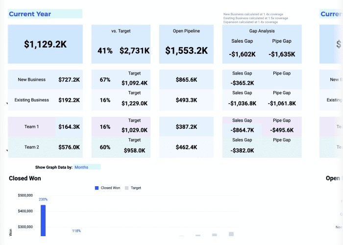
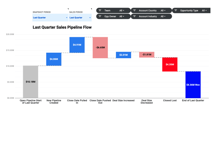
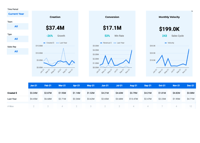
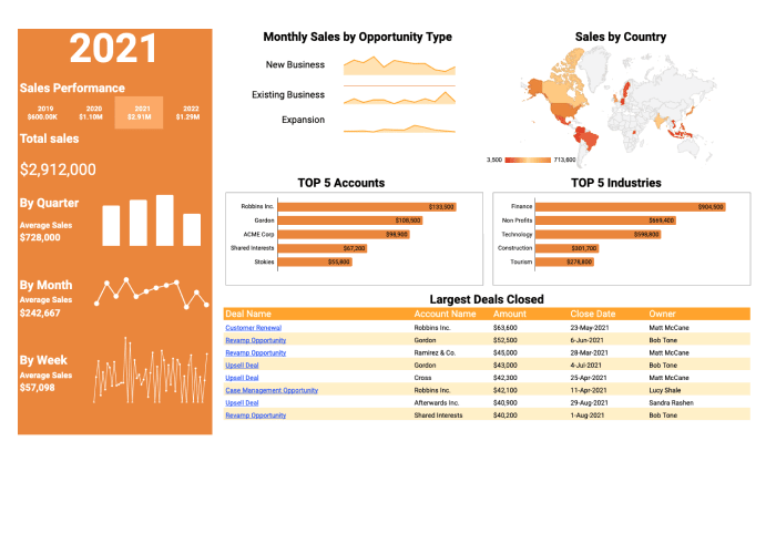
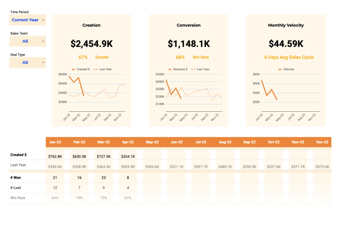
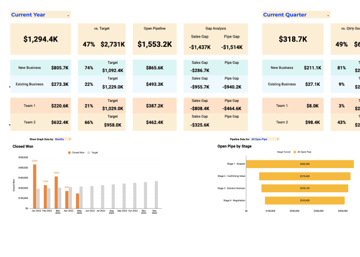
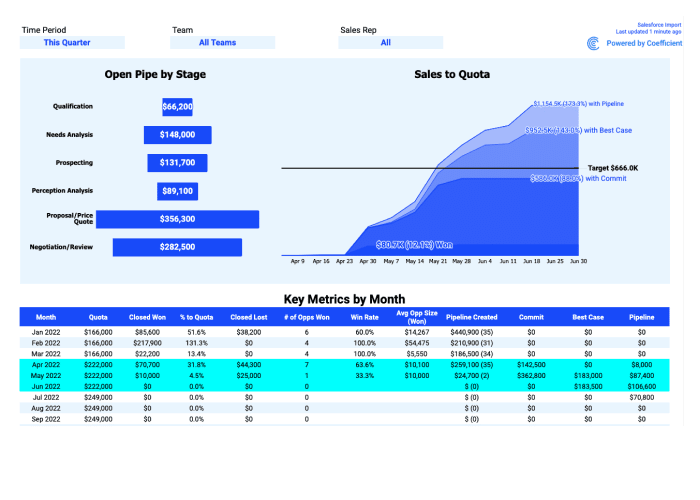
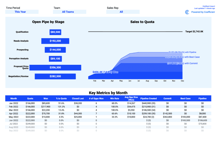
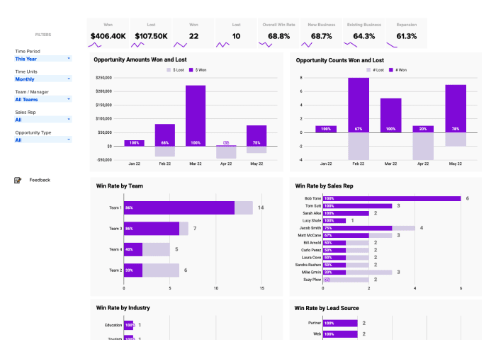
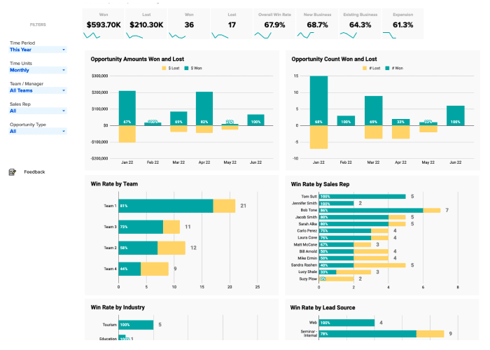
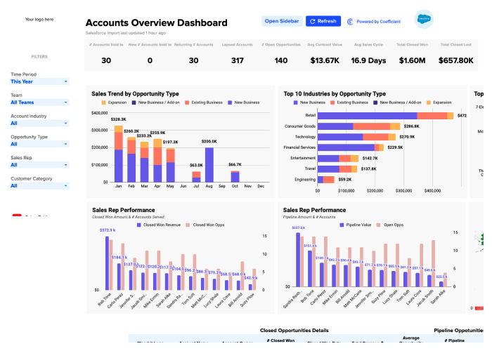
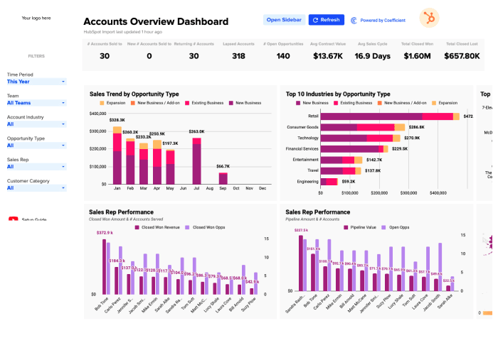
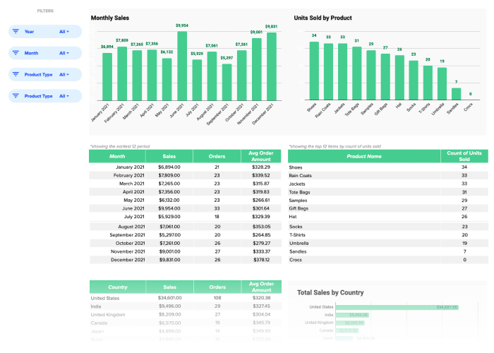
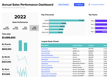
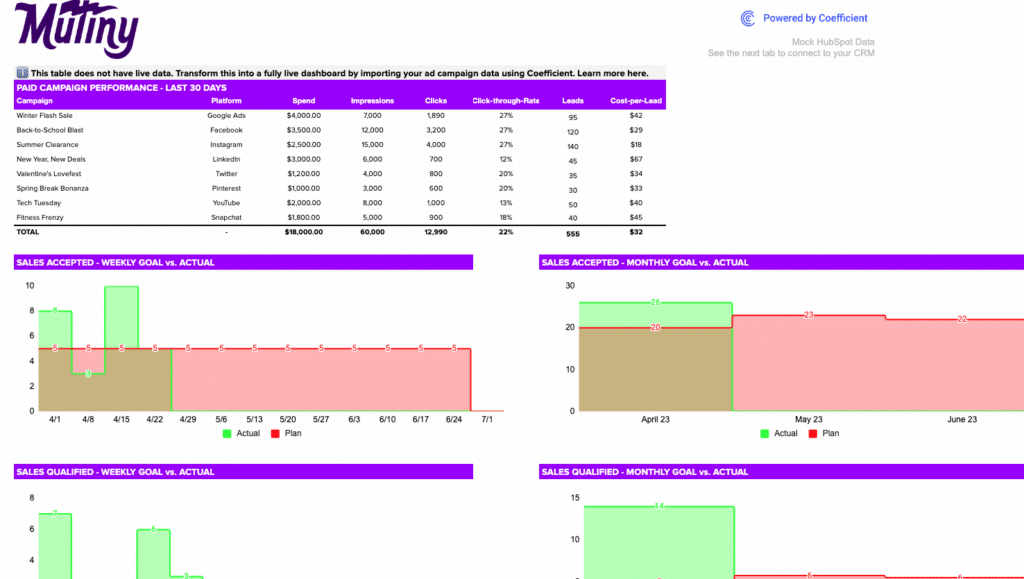
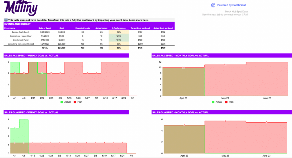
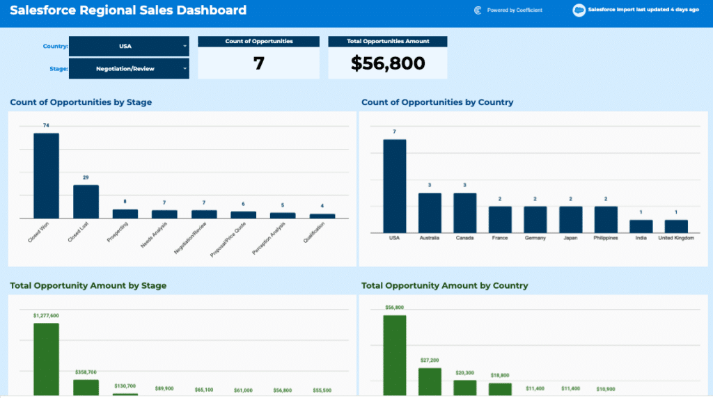
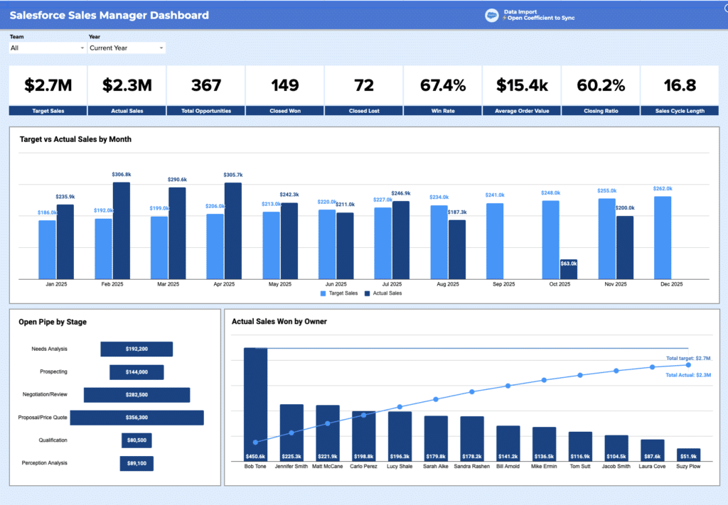
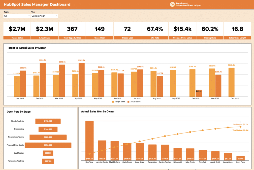
Sales and pipeline dashboard examples
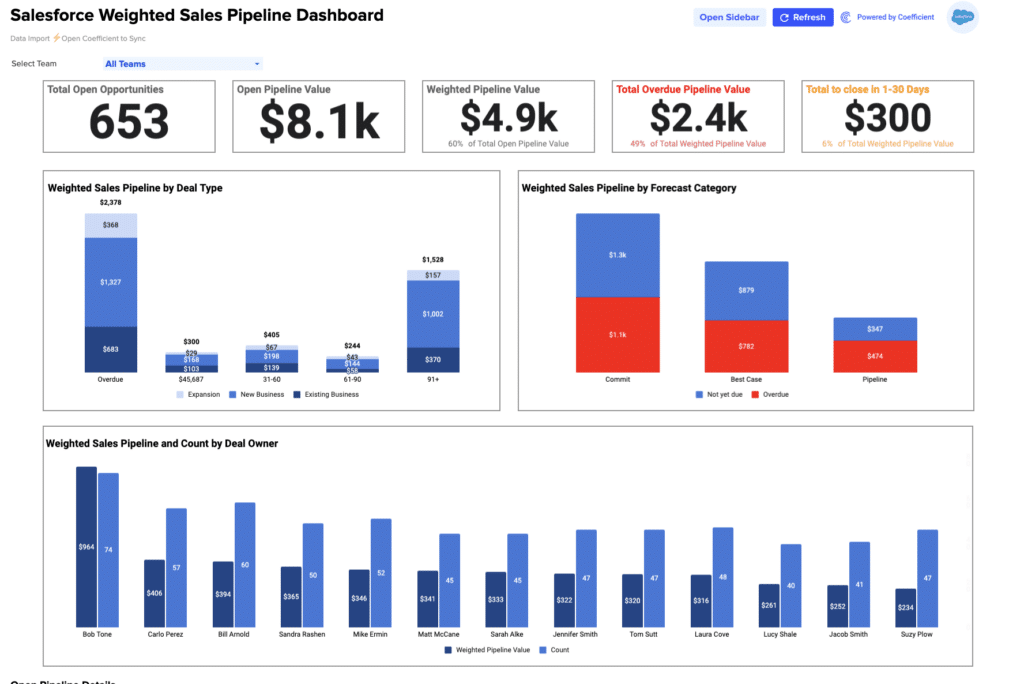
Sales dashboard examples are built for revenue teams who need weekly visibility into sales pipeline
health and forecast accuracy. Core KPIs: total pipeline value, weighted forecast vs. target, win
rate by rep or segment, average deal age, deals created, and quota attainment.
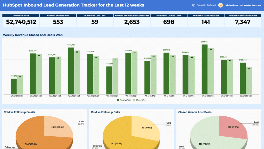
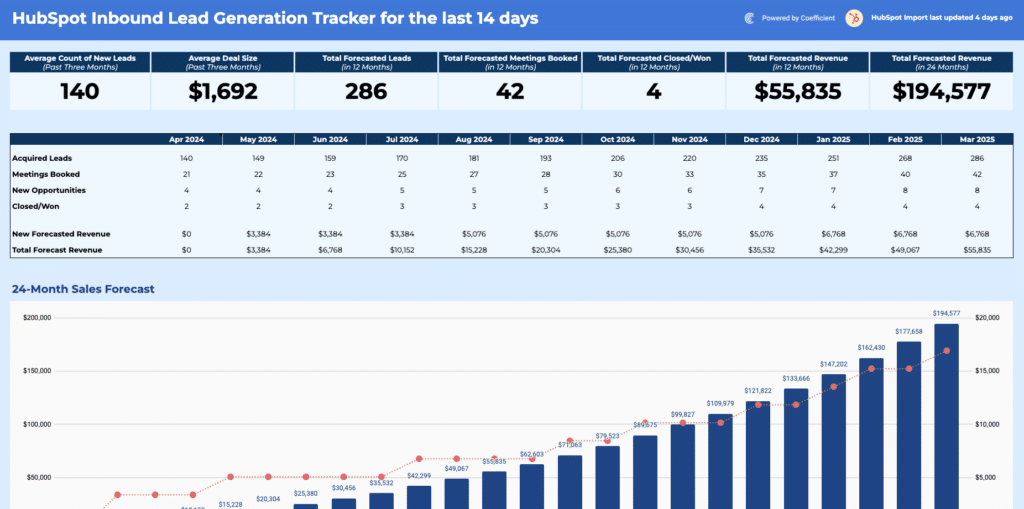
Examples in
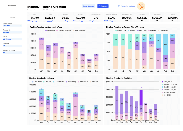
this library include the Salesforce Pipeline
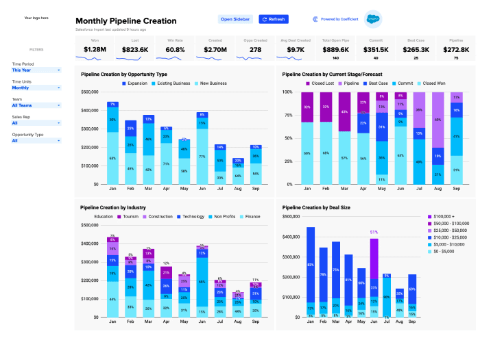
Analysis Template, HubSpot Pipeline
Analysis Template, Salesforce
Sales-to-Target Template, HubSpot Sales Operations
Dashboard Package, Salesforce Sales Operations
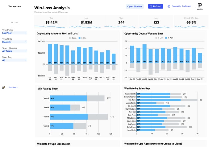
Package, Salesforce
Win-Loss Analysis, and HubSpot Win-Loss
Analysis. All connect to live CRM data from Salesforce and HubSpot.
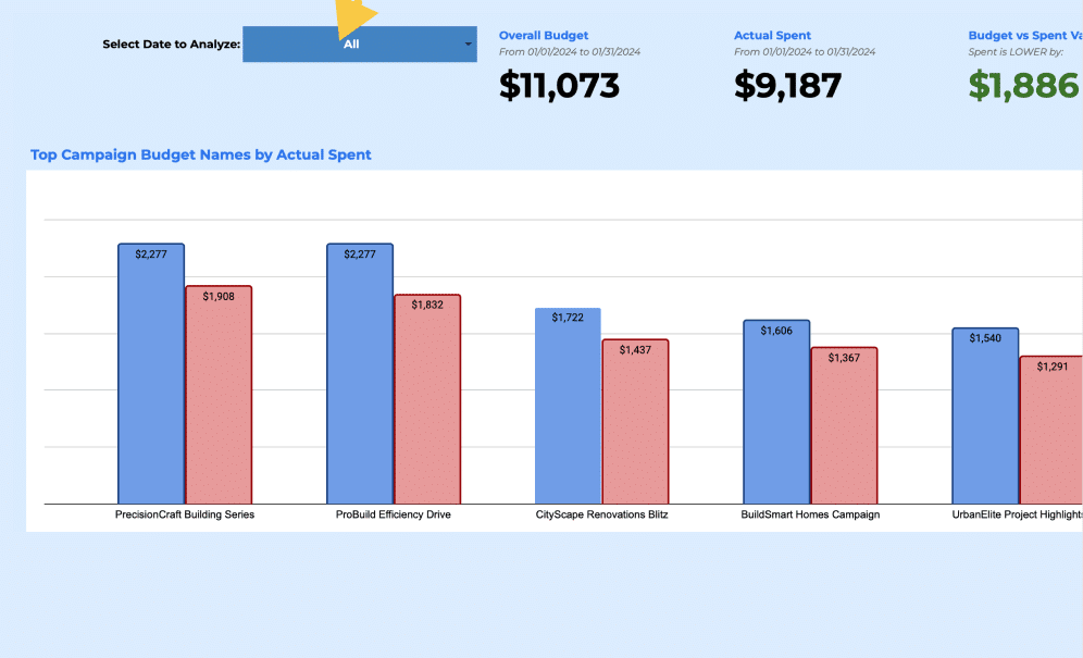
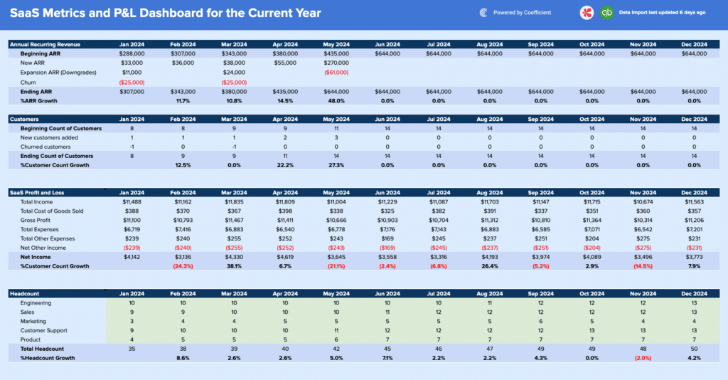
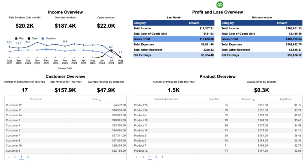
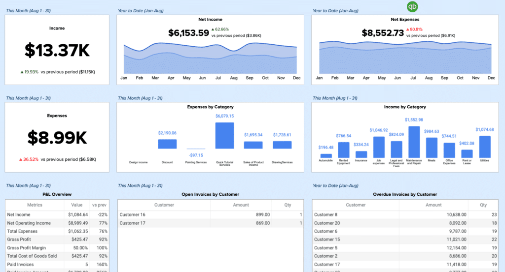
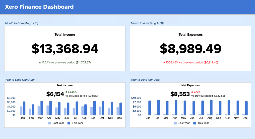
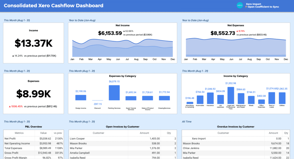
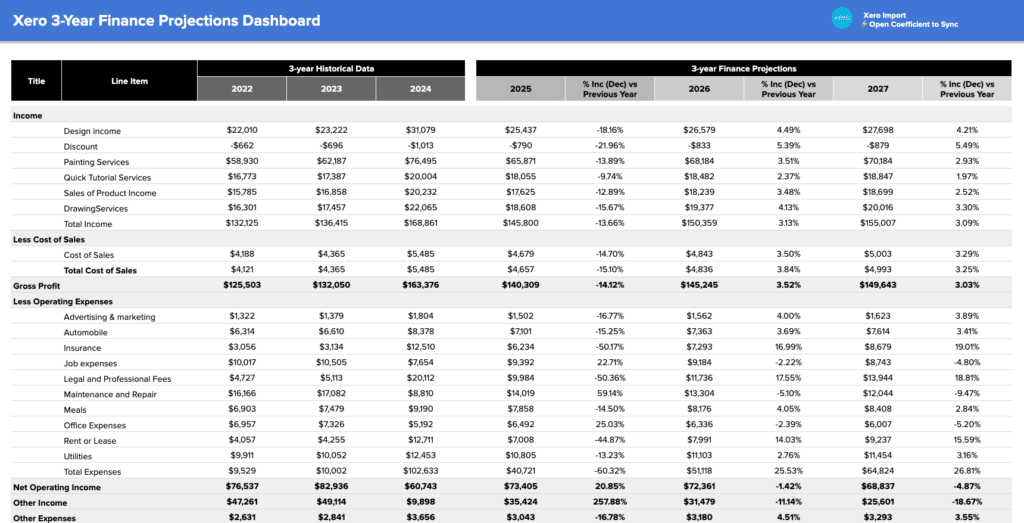
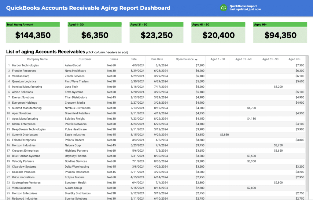
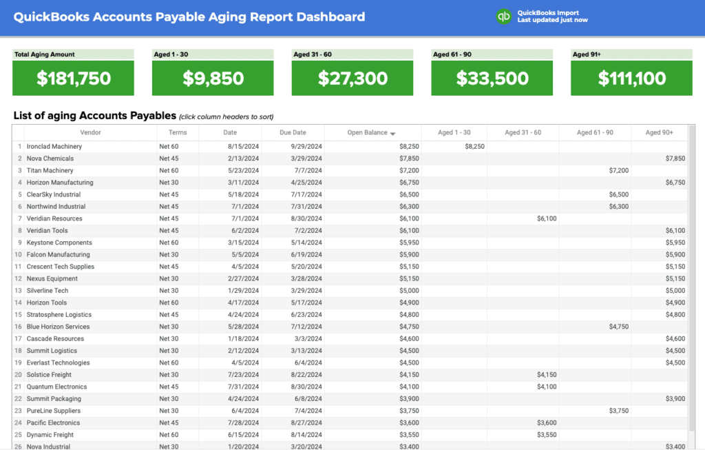
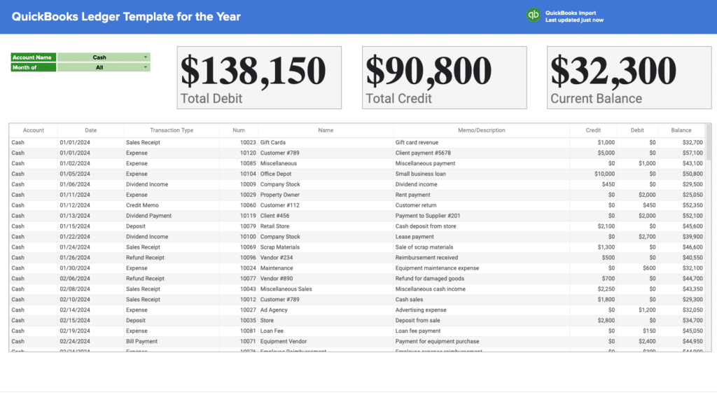
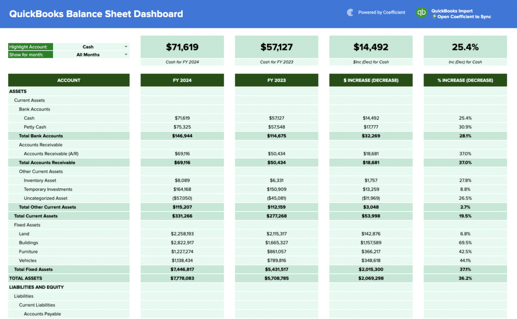
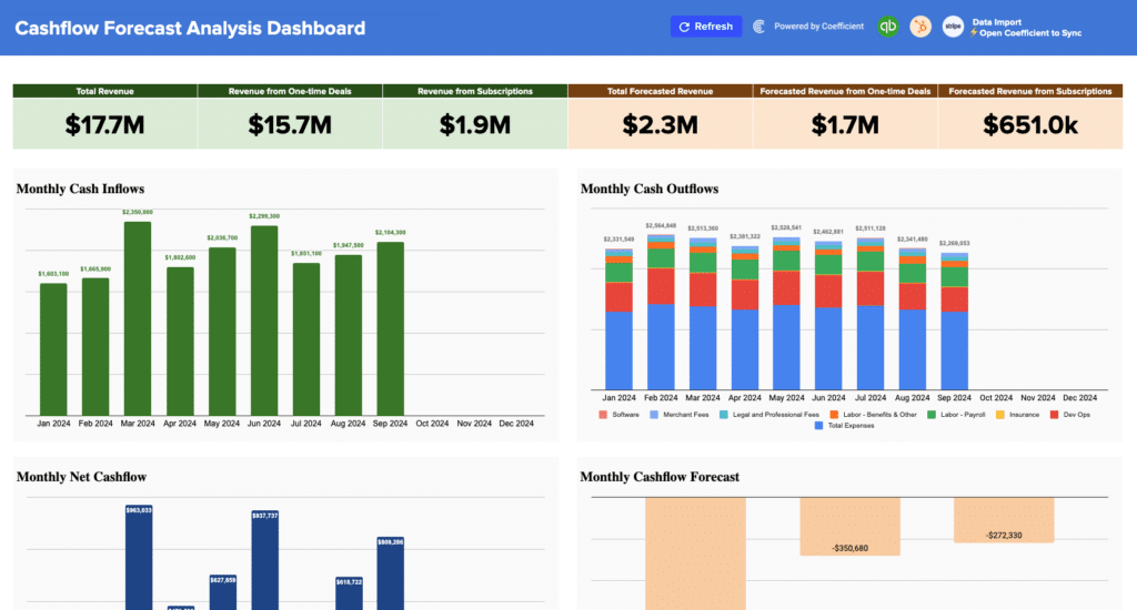
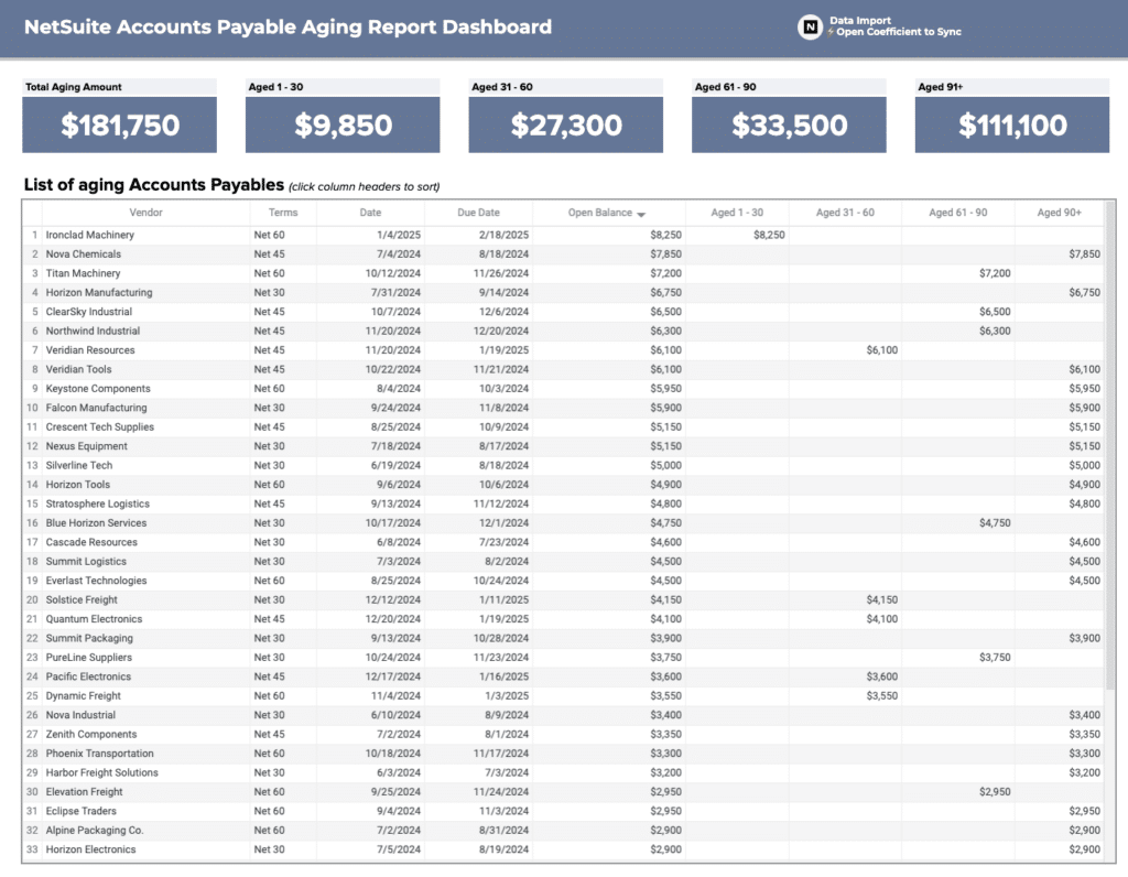
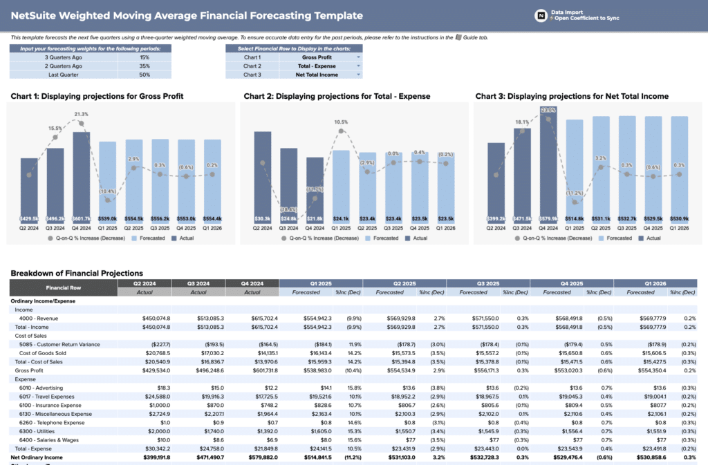
Finance and accounting dashboard examples
Finance dashboard examples give accounting and FP&A teams visibility into revenue performance and
cash health. Core KPIs: gross revenue, gross margin, net income, budget vs. actuals by department,
accounts receivable aging, cash flow by week, and operating expenses.
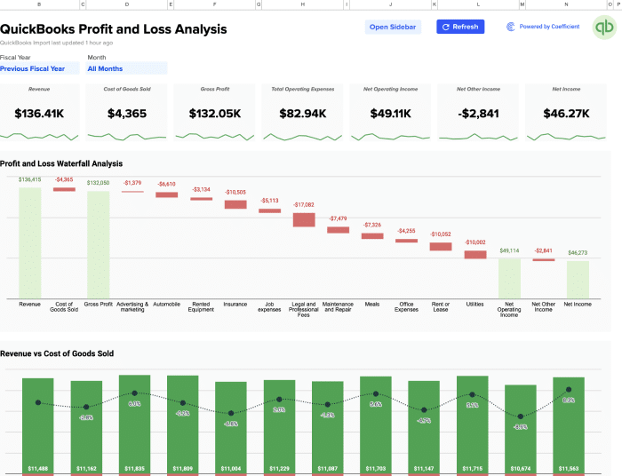
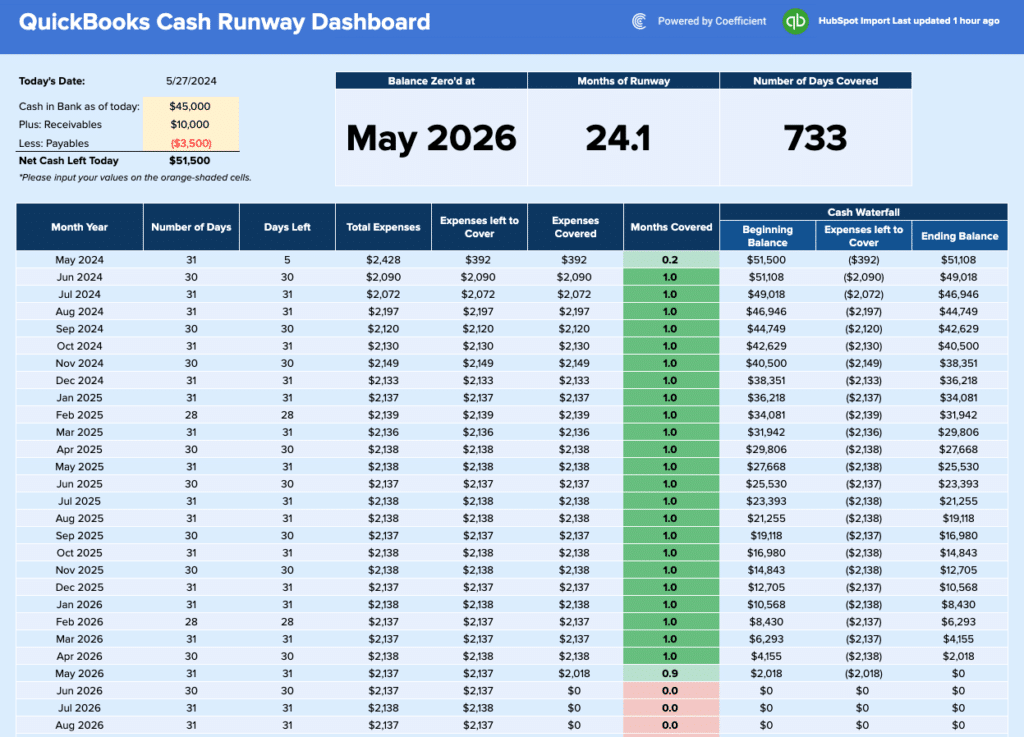
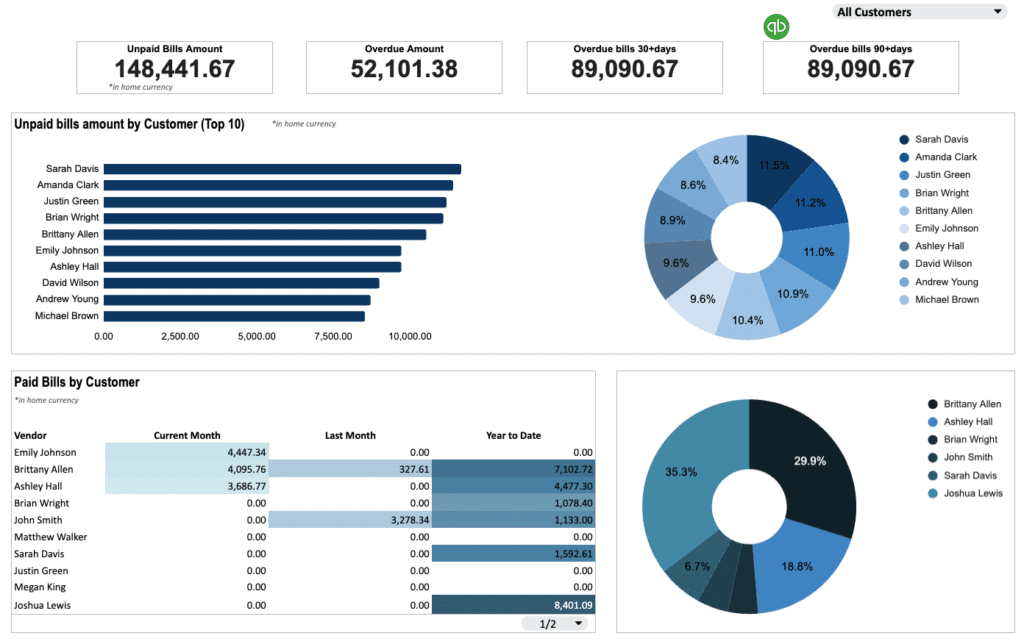
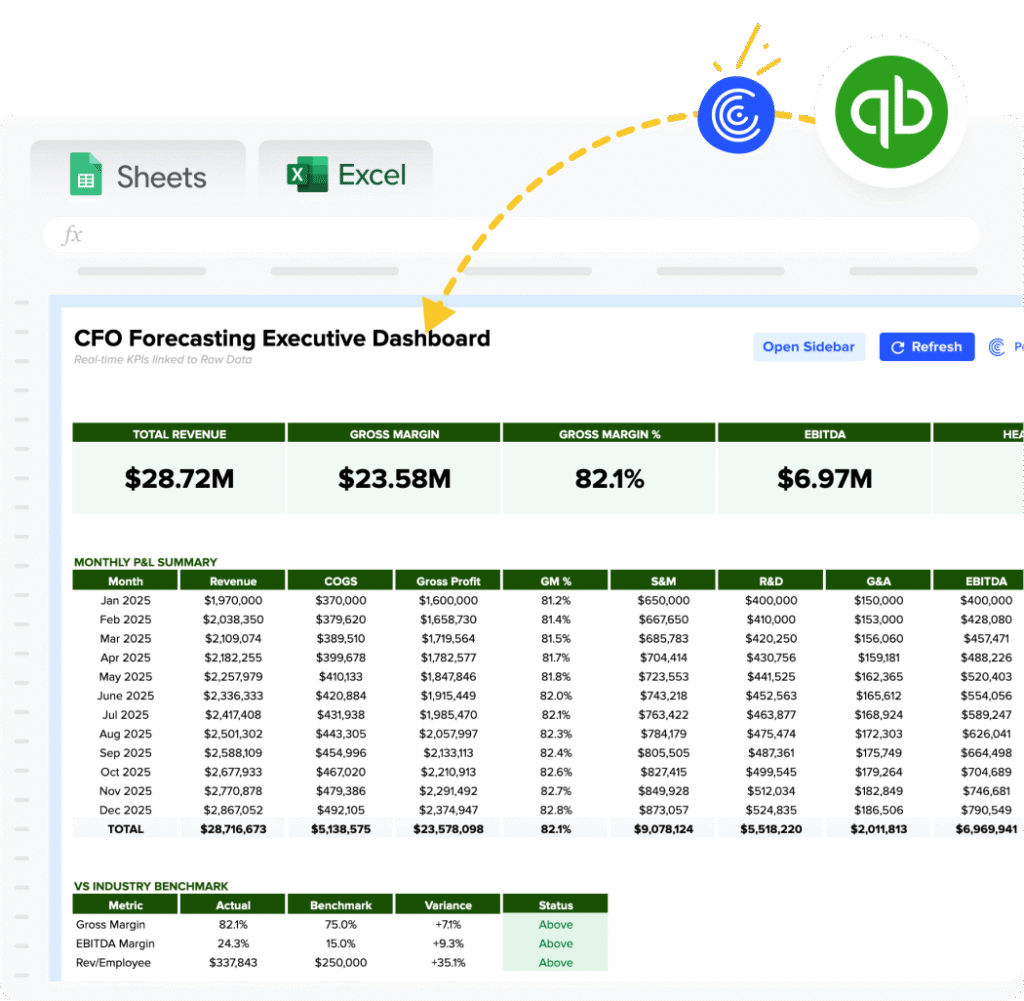
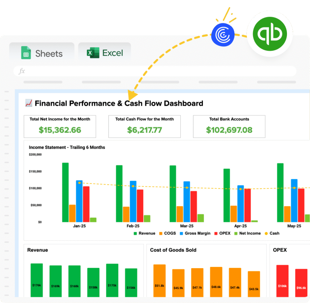
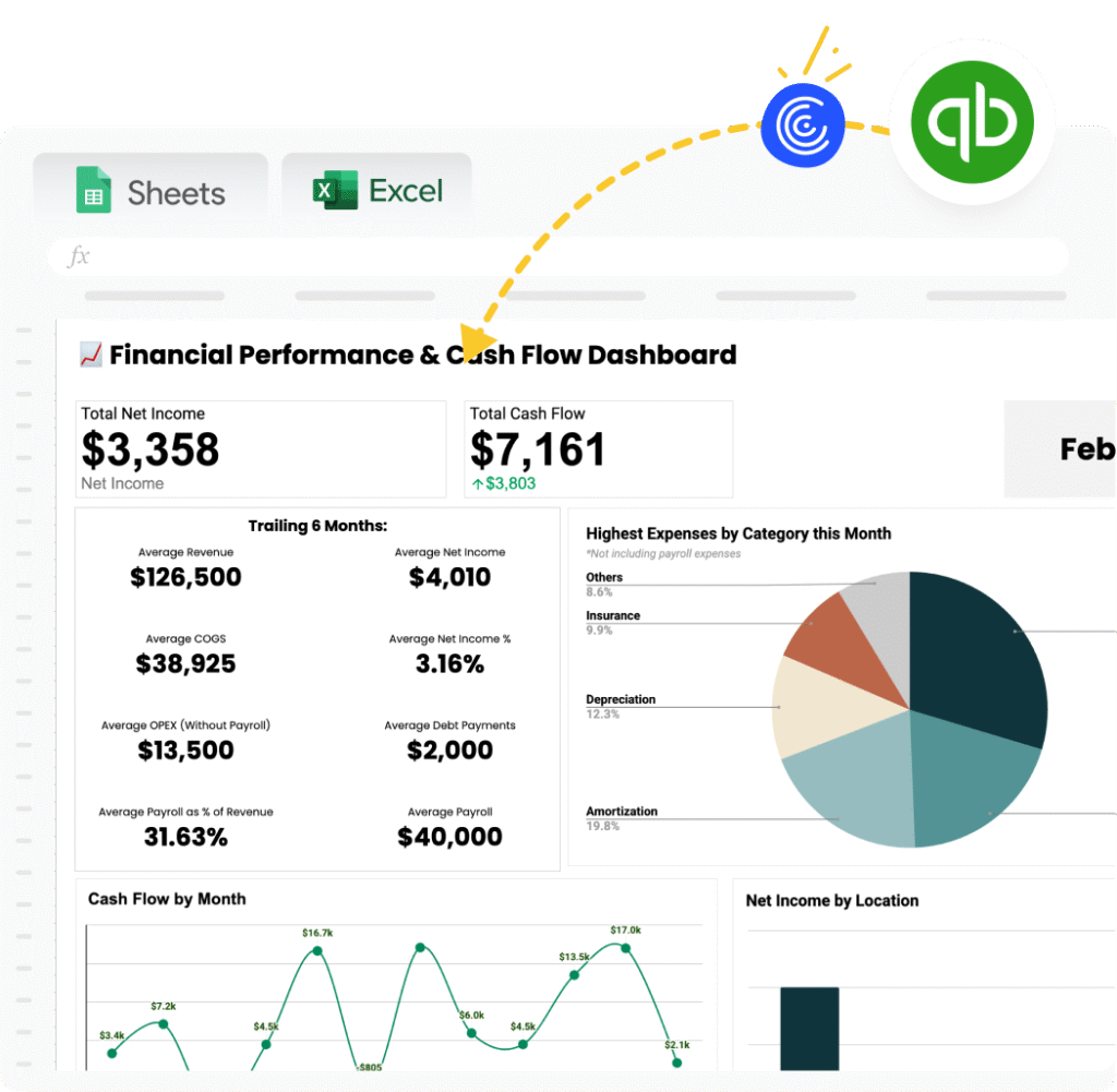
Examples include the QuickBooks
Profit and Loss Template, which pulls live data from QuickBooks. Additional
finance and accounting templates are available using the Finance and Accounting filter above the
gallery.
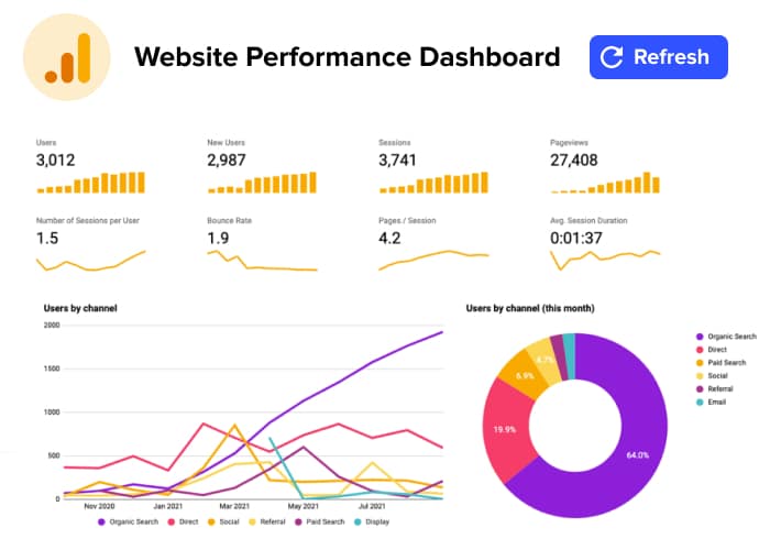
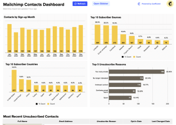
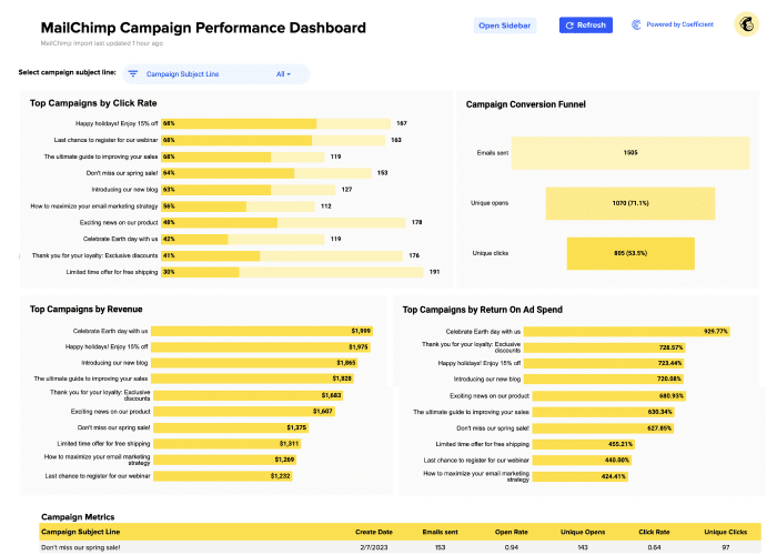
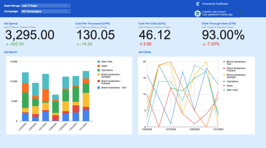
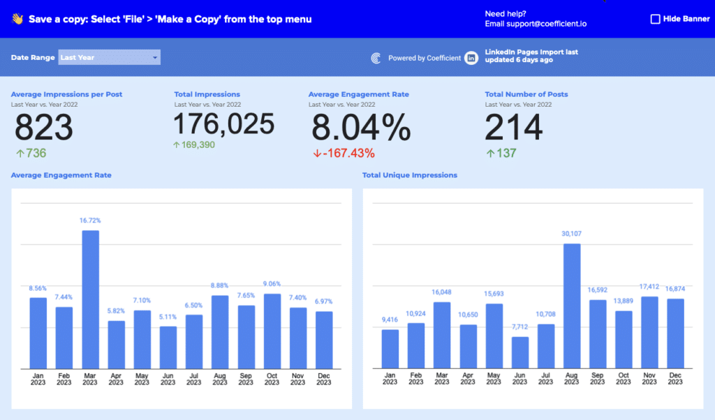
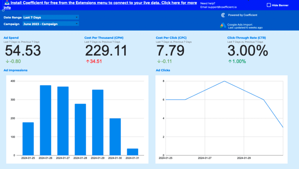
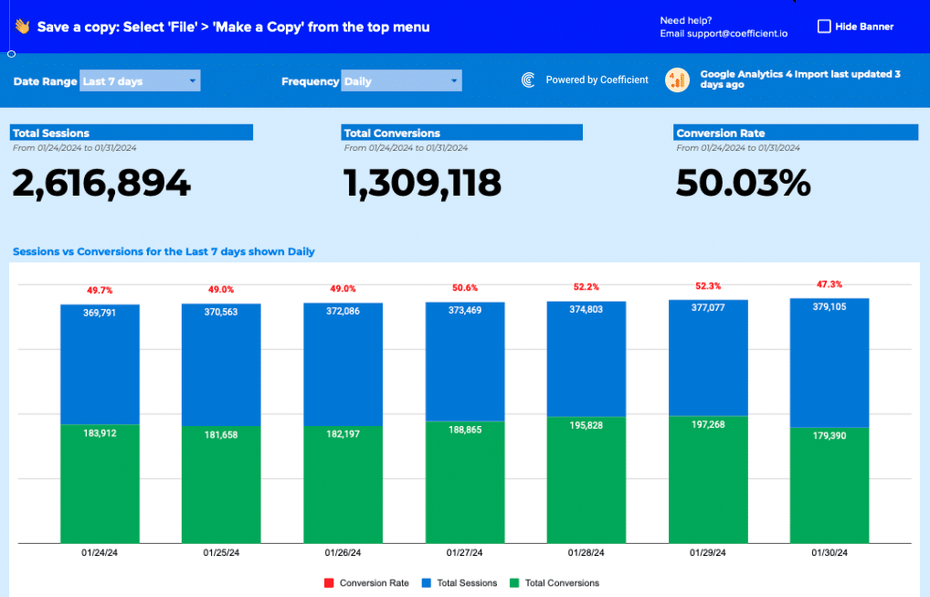
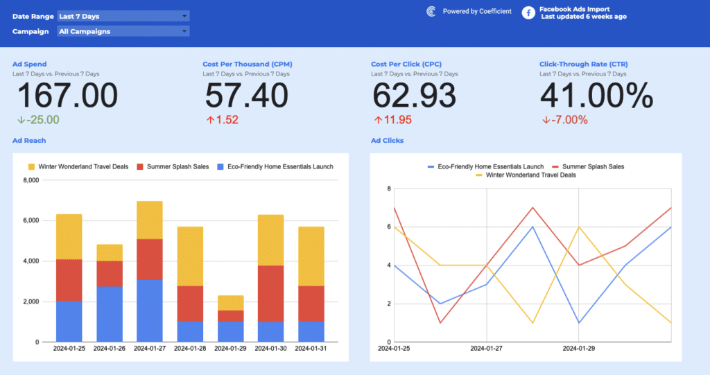
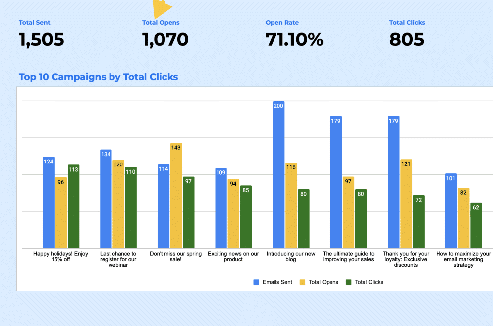
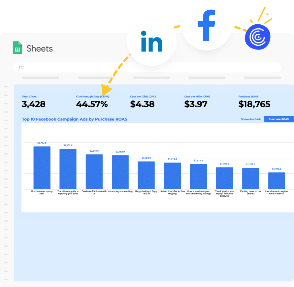
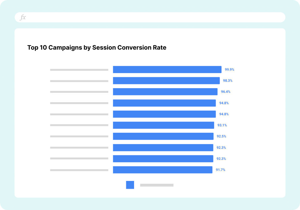
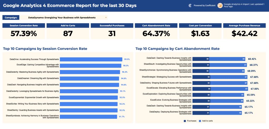
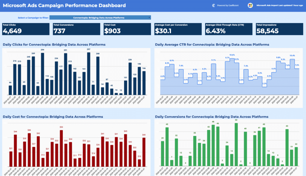
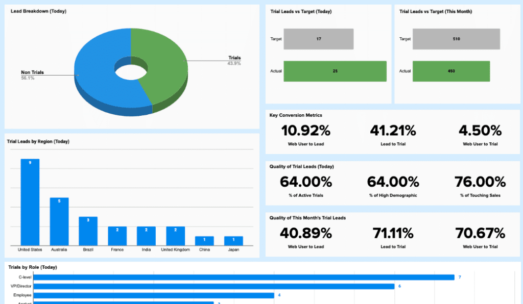
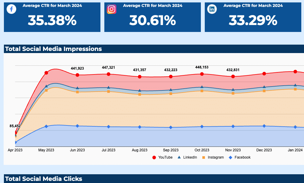
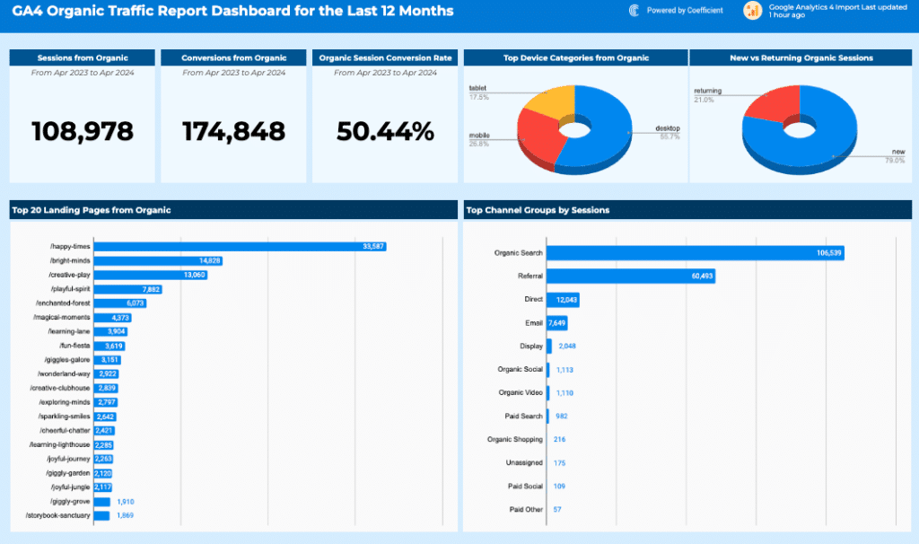
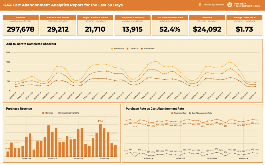
Marketing performance dashboard examples
Marketing dashboard examples give demand generation and marketing ops teams visibility into channel
efficiency and pipeline contribution. Core KPIs: sessions by channel, MQL volume, cost per
acquisition, lead-to-MQL conversion rate, email open rate, click-through rate, and return on ad
spend.
Examples include the Google
Analytics Website Performance Template, Mailchimp
Campaign Performance Dashboard, and Mailchimp Contact
Dashboard. Use the Marketing filter above the gallery for the full set which includes SEO
dashboards, google ads reports and more.
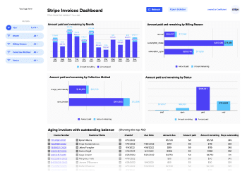
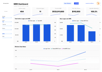
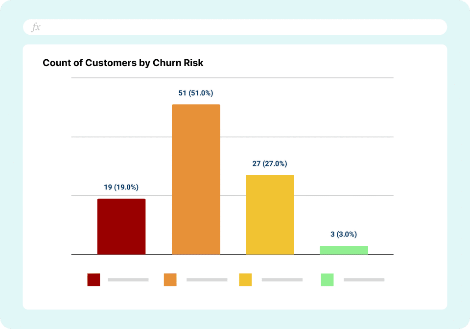
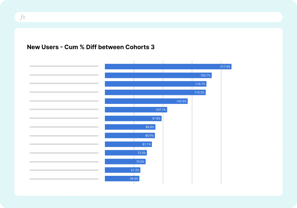
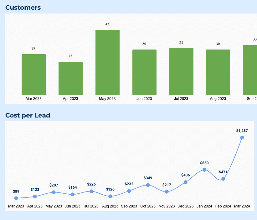
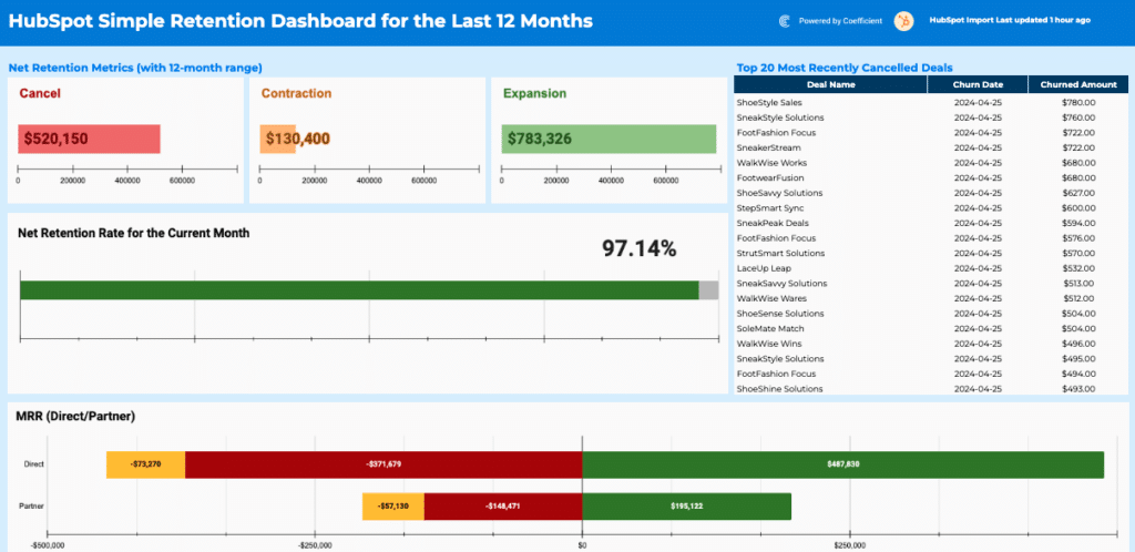
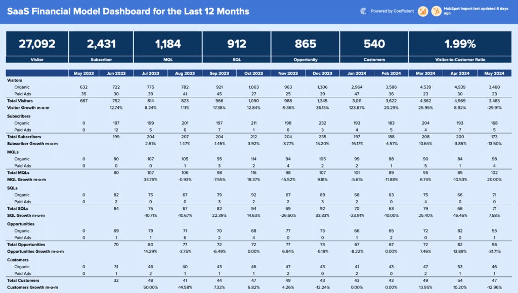
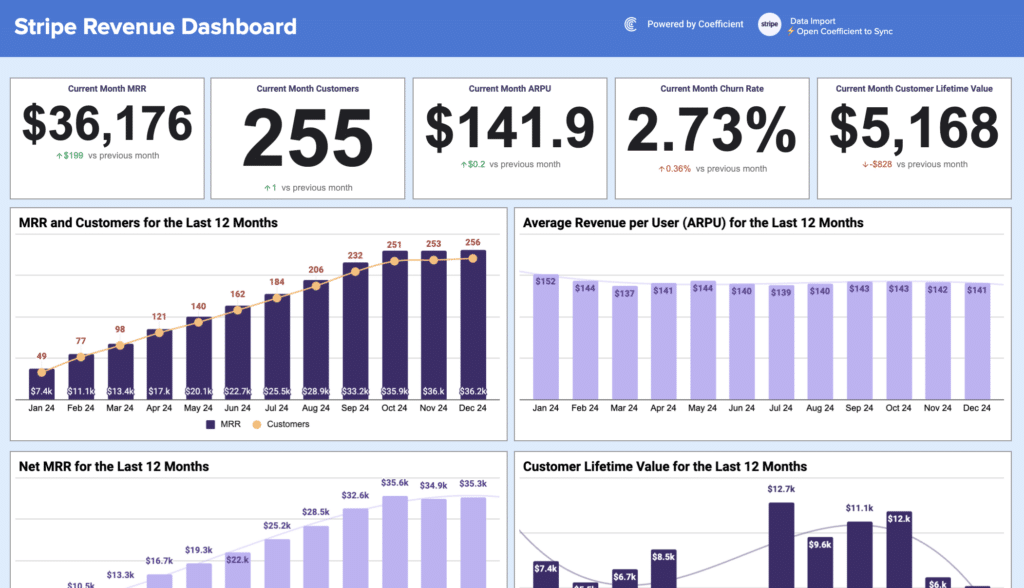
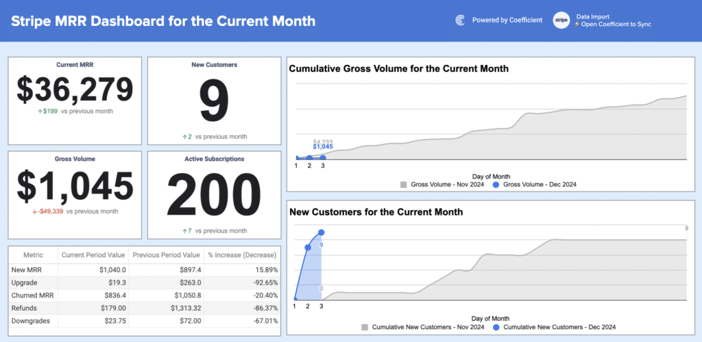
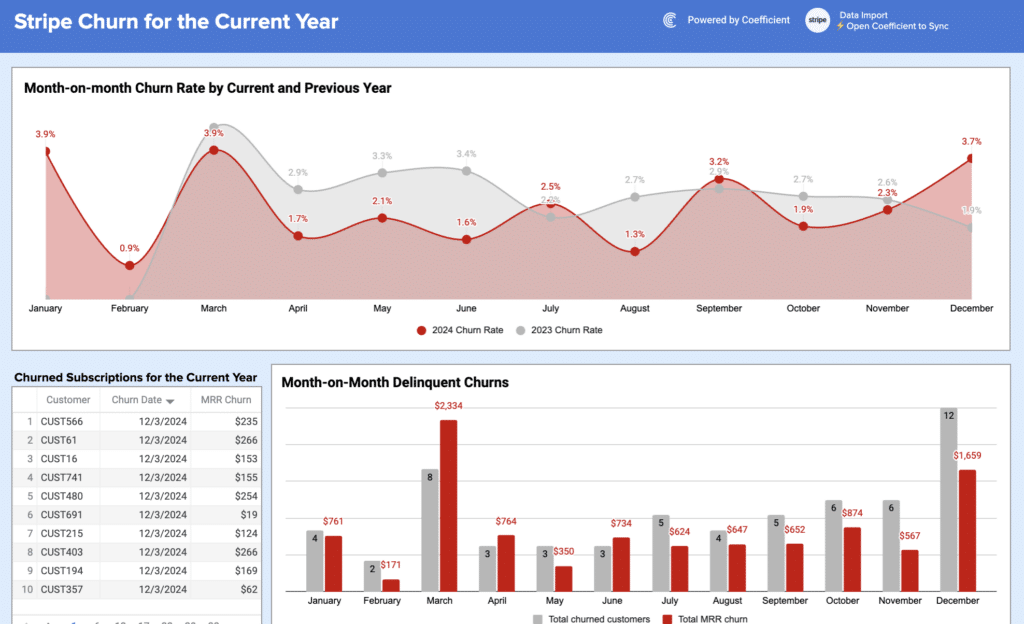
SaaS metrics dashboard examples
SaaS dashboard examples give startups, product and finance teams visibility into subscription health
and growth efficiency. Core KPIs: MRR, ARR, customer churn rate, net revenue retention,
trial-to-paid conversion, and customer lifetime value.
Examples include the HubSpot MRR
Dashboard, the Stripe Invoices
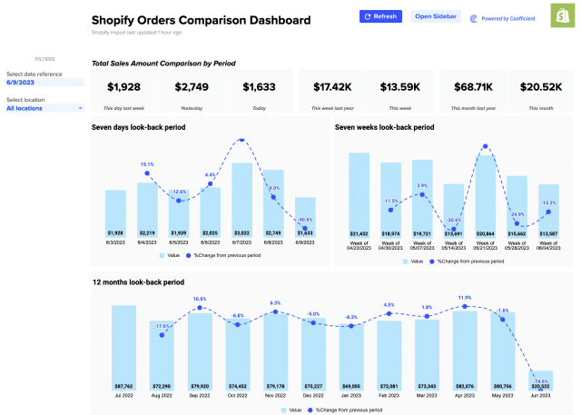
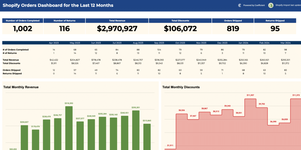
Dashboard, and the Shopify
Sales Dashboard. Use the SaaS filter above the gallery for all available templates.
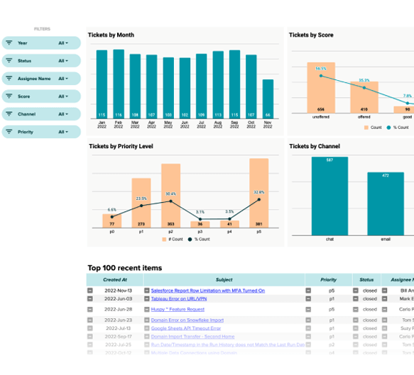
Operations and project dashboard examples
Operations dashboard examples give project managers and ops leads visibility into task completion,
resource allocation, and timeline performance. Core KPIs: task completion rate, milestone status,
budget vs. actual spend, team capacity utilisation, and issue resolution time.
The Zendesk Tickets
Dashboard is a useful starting point for customer support operations. Use the connector
filters above the gallery to browse templates connected to project and operations tools.
Static dashboard examples vs live dashboards
A static dashboard template is a pre-built file you populate with your own data. The charts and layout are configured for you where you add the numbers and the visuals update. Static templates work well when the data is self-contained: a project budget, a quarterly planning model, or a report updated manually on a predictable schedule.
A live dashboard connects directly to the system where the data originates. When a deal moves stages in Salesforce, the pipeline dashboard updates. When QuickBooks records a payment, the cash flow dashboard reflects it. Coefficient connects Google Sheets and Excel to 150+ business systems with scheduled auto-refresh, so the dashboard stays current without anyone managing an export workflow. Both approaches use the same template structure and the difference is whether data is entered in the template manually or automatically.
How to choose the right dashboard example
Start with the audience. A dashboard for a sales rep looks different from one for a CFO, even when both pull from the same data. Identify who reads the dashboard and what they need to decide before selecting a template.
Then identify the three to five metrics that should drive the next action. If a metric does not change how someone behaves, it should not be on the dashboard. More metrics add visual noise without adding decision support.
Finally, consider data freshness. If the dashboard needs to reflect current data to be useful and if the data lives in an external system, a live connection will save significant ongoing maintenance. If the data is self-contained or updated on a predictable schedule, a static template is the right starting point.
Frequently Asked Questions
Do I need to connect to Coefficient to use these dashboard templates?
No. Every dashboard template in this library is fully functional as a static dashboard without any account or connection. Open the template, make a copy, and enter your data directly. Connecting to Coefficient is optional and adds automated live data refresh from source systems. The dashboard structure and visuals are identical whether used statically or with a live connection.
What is a dashboard example?
A dashboard example is a pre-built template that demonstrates which KPIs a specific type of business dashboard should include, how those metrics should be laid out, and what chart types work best for each data type. Dashboard examples are useful as both design references and functional starting points — open the template, replace the sample data, and have a working dashboard immediately.
What are the main types of dashboards?
The four main types are: operational dashboards (current state, daily or weekly, for team leads), analytical dashboards (trend and pattern analysis, for analysts), strategic dashboards (high-level company health, for executives), and tactical dashboards (performance against a specific initiative or campaign). Most templates in this library are operational or analytical dashboards.
What should a business dashboard include?
A well-designed dashboard includes five to eight KPIs relevant to its audience, a clear visual hierarchy with the most important metric top-left, consistent chart types matched to the data (line for trends, bar for comparisons, scorecard for single numbers), and a clean separation between data input and visual display layers.
What is the difference between a Google Sheets and an Excel dashboard?
Both use the same structural approach but differ in key ways. Google Sheets is better for real-time collaboration and browser-based access with no software install. Excel is stronger for complex calculations and larger datasets that benefit from desktop processing power. Most templates in this library are available in both formats — Google Sheets templates here and Excel templates here.
How do I make a dashboard update automatically?
Connect your Google Sheets or Excel dashboard to a live data source using Coefficient. Coefficient connects to 150+ business systems and refreshes data on a schedule you set between hourly, daily, or weekly. Once the connection is active, the dashboard updates without anyone touching the file. Slack and email alerts are also available to notify you when key metrics change.
Browse the dashboard examples in the gallery above or start with a live connection free to have your data flowing into a dashboard today.